AEROTERM — Air Conditioning & Ventilation
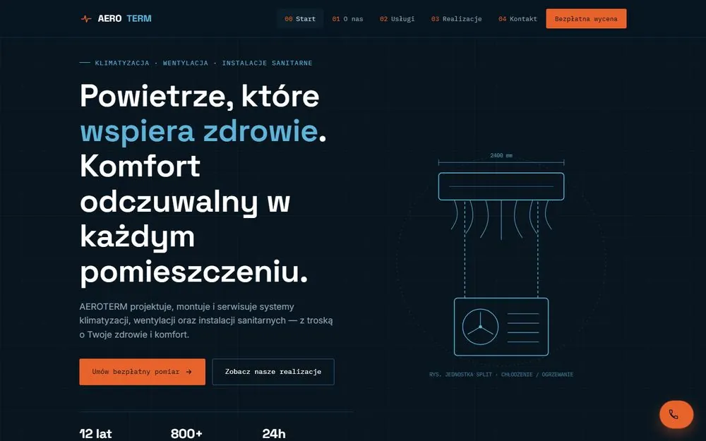
A website for an installation company run like technical documentation — sheets, cross-sections, drawing numbers. In this trade customers buy trust in precision, so the site itself has to look calculated to the millimetre.
This is a showcase project — the company name, figures, certificates and jobs on the site are fictional.
Starting point
HVAC companies mostly look the same online: a photo of an air conditioner, a list of brands, a phone number. It is hard to tell from that who will really design a quiet, efficient system. This site is meant to show an engineering mindset before the visitor has read a single sentence.
What the site contains
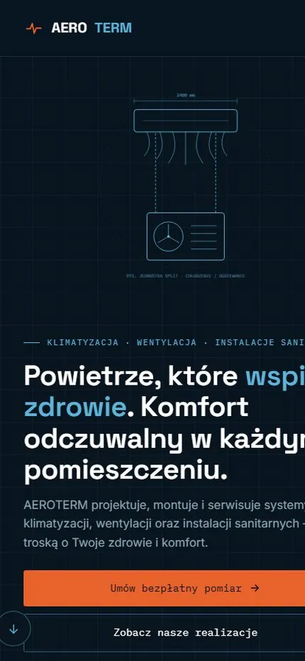
- A “technical drawing” theme — navigation with sheet numbers (00–04), line drawings instead of stock photos, monospaced type in descriptions.
- An “About” section with (sample) specifics: F-gas and electrical qualifications, test measurements before handover, unit noise levels.
- Six services with parameters — for each: lead time, warranty length, a key figure.
- A portfolio of jobs with order numbers and building type (office block, restaurant, house, apartment building).
- Stats in the hero — right away, no scrolling.
- A persistent “Free quote” CTA in the header and a floating phone button.
Design decisions
A navy background with a millimetre-paper grid, a cool blue accent (air, comfort) plus orange on actions (energy, warmth). Every service got measurable parameters, because in this trade “professional and solid” means nothing, while a specific warranty and a leak test do.
Technology
Plain HTML, CSS and JavaScript, no CMS. The technical drawings are lightweight vector graphics (SVG) — sharp on every screen. Hosting on Netlify, HTTPS included.
See it live
The full site with all its sections and the portfolio of jobs.